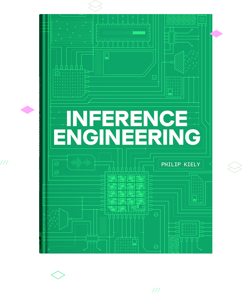
I have been working through Inference Engineering by Philip Kiely — a book for engineers who want to understand the technologies that power every AI company and application in the world. Along the way I built a handful of interactive visualizations to make some of the denser chapters click for me. Reading about attention or the roofline model is one thing; being able to drag a slider and watch the numbers move is another.
These are companions to specific sections of the book, not a replacement for it. Each one maps to a section number so you can read the corresponding chapter and then come play with the idea here.
How to use them
Each visualization is a single, self-contained page — no dependencies, no tracking, dark/light aware. Open any of them in a new tab and start poking at the controls.
The visualizations
- Dimensionality, Visualized (§2.1) — how the model, sequence, and batch dimensions compose, and where the shapes flowing through a transformer come from.
- Activation Functions, Visualized (§2.1.2) — the common activation functions side by side, and how each one shapes the signal.
- The Transformer Pipeline, Visualized (§2.2.2) — a walk through a transformer block end to end, from input embeddings out the other side.
- Attention, Visualized (§2.2.3) — how queries, keys, and values interact to produce the attention pattern.
- Mixture of Experts, Visualized (§2.2.4) — routing tokens to experts, and how sparse activation changes the compute story.
- Roofline, Ops:Byte & Arithmetic Intensity (§2.4.1) — the roofline model, and how arithmetic intensity decides whether you are compute- or memory-bound.
- Quantization Granularity, Visualized (§5.1.1) — how the scope of a scale factor — per-tensor, per-channel, or per-block — trades accuracy against the cost of storing more scales.
- Model Parallelism: TP · PP · EP · DP, Visualized (§5.4) — what each parallelism axis divides (tensors, layers, experts, or just the traffic), and how they cross-cut: place a model on real nodes and see TP inside NVLink, PP or EP across InfiniBand, and DP wrapping it all.
If you spot something wrong or have an idea for another section worth visualizing, let me know.